

David McMillan
Crypto-enthusiast who explores all the possibilities the blockchain technology suggests
Golden Cross Vs. Death Cross In Trading
Table of Contents
On charts, you can often see moving average crossovers — and they form two key signals of technical analysis: the golden cross and the death cross. These patterns help determine when the market may switch from a growth phase to a decline and vice versa. In this article, we will examine in detail what each of them looks like, what they mean for a trader, and how they differ from each other in practice.

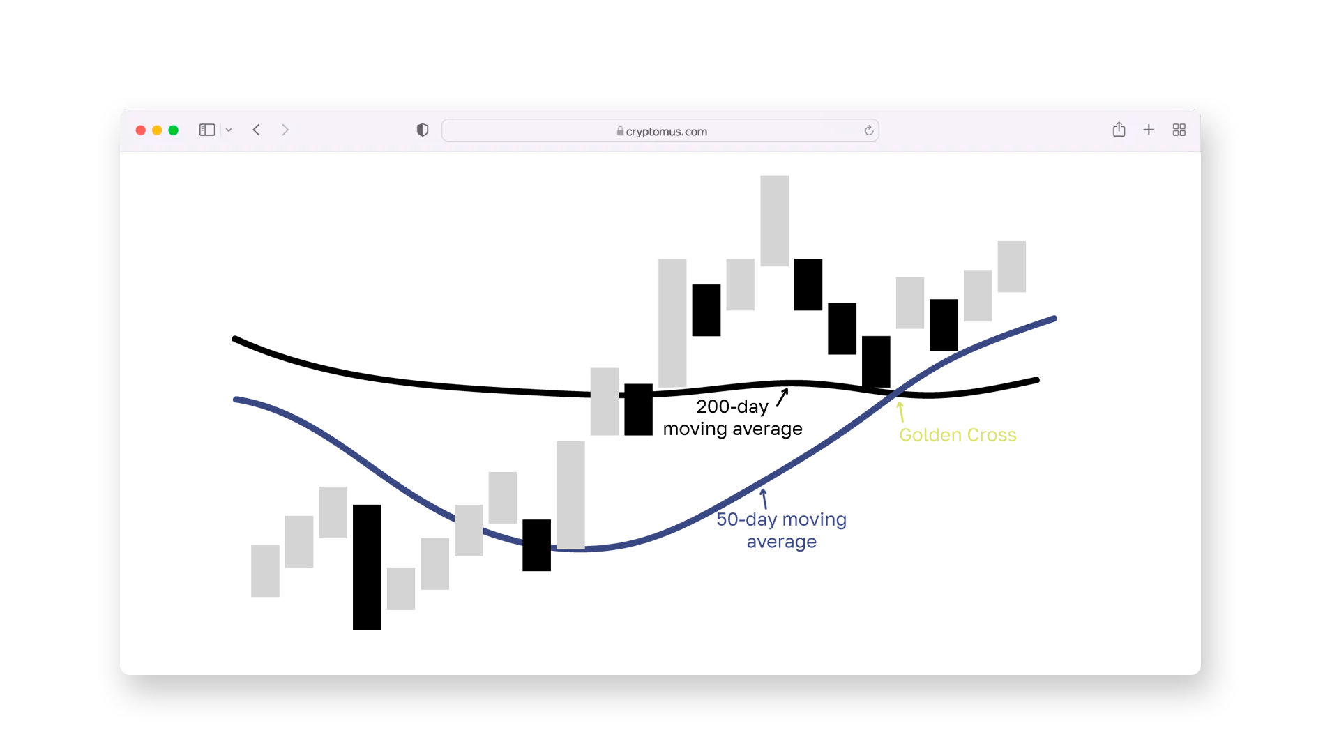
What Is The Golden Cross Pattern?
Golden Cross is a bullish signal in technical analysis that indicates the possible beginning of a sustainable uptrend. It occurs when a short-term moving average (usually 50-day) crosses a long-term moving average (usually 200-day) from bottom to top. This pattern:
- Occurs after a decline or consolidation phase;
- Indicates a change in trend towards growth;
- Is considered more reliable if accompanied by an increase in trading volume;
- Often used to confirm entry into long positions.
As a rule, after the formation of the golden cross, the price continues to move up. However, the signal does not guarantee growth, so it is recommended to use it in conjunction with other analysis indicators.
See how the pattern looks on the chart below:
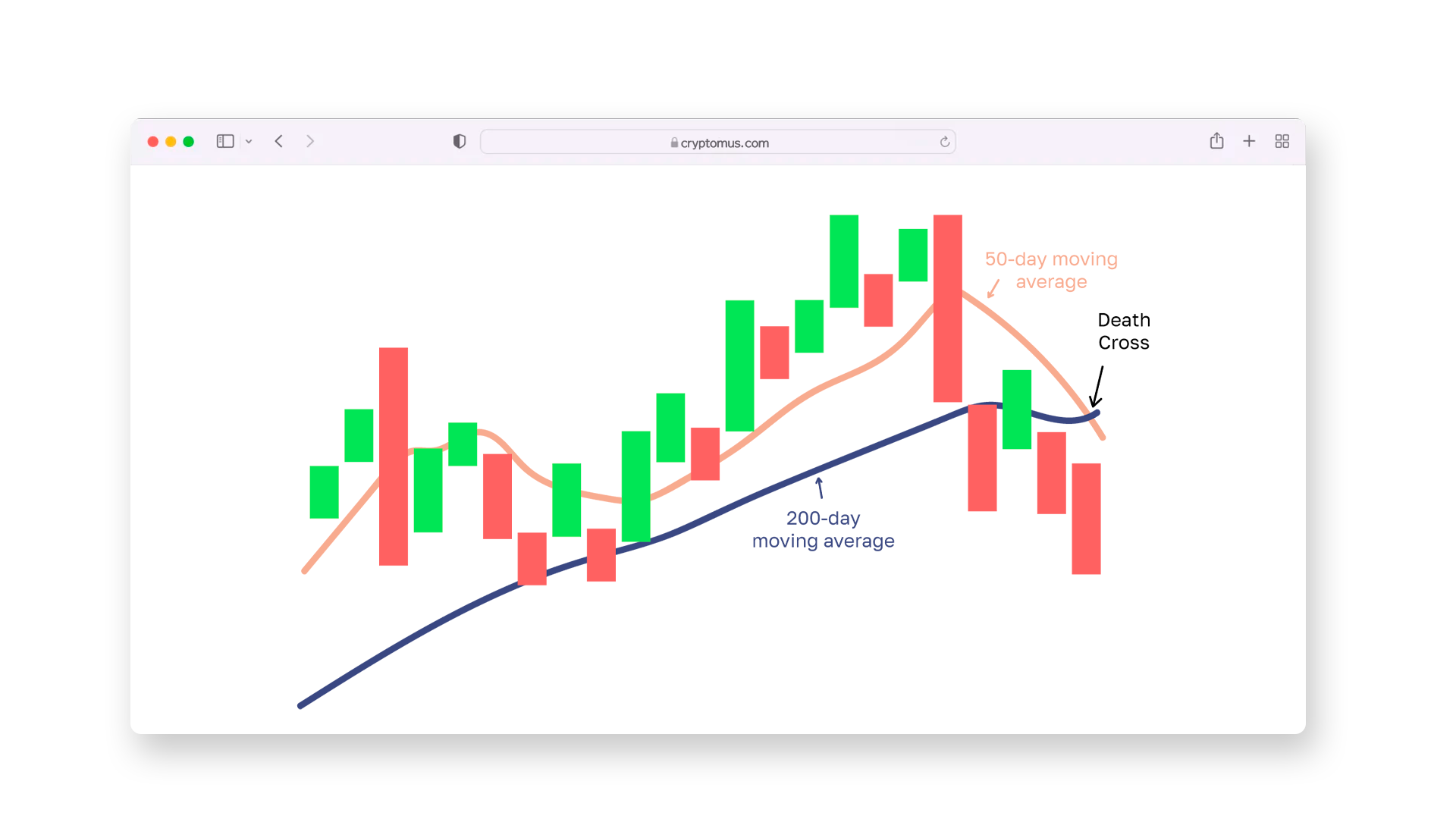
What Is The Death Cross Pattern?
Death Cross is an opposite signal, indicating a potential reversal to the downside. It is formed when a short-term moving average (e.g., 50-day) crosses a longer-term moving average (e.g., 200-day) from top to bottom. This pattern:
- Appears after an uptrend or sideways phase;
- Indicates increasing selling pressure and the possible start of a downtrend;
- Grows stronger when trading volume increases at the time of the cross;
- Often used as a signal to exit long positions or look for an entry point for a short.
Death Cross is especially significant on daily charts, where it can indicate a longer decline, but, like any indicator, requires confirmation.
See what the pattern looks like on the chart below:
Golden Cross Vs. Death Cross
Both patterns are built on the intersection of moving averages but indicate opposite market scenarios. To clearly see the differences between these two signals, let's compare them by key parameters:
| Characteristic | Golden Cross | Death Cross | |
|---|---|---|---|
| Signal type | Bullish (for a growth) | Bearish (for a fall) | |
| Crossing | Short-term SMA crosses the long-term from bottom to top | Short-term SMA crosses the long-term from top to bottom | |
| Context of occurrence | After a decline or accumulation | After growth or consolidation | |
| Expected market behavior | Beginning of an uptrend | Beginning of a downtrend | |
| Strategy recommendations | Finding a long entry point | Exiting a position or entering a short | |
| Confirming factors | Growing volume, general market sentiment | Increased sales, external news |
In short, the Golden Cross and Death Cross are opposite market signals formed by the crossover of short-term and long-term moving averages.
- Golden Cross appears when the short-term average moves above the long-term one, often after a market pullback, and is seen as a sign of potential growth.
- Death Cross is the reverse: the short-term average drops below the long-term, typically after a rally, suggesting that a downtrend may be starting.

These patterns are two straightforward yet useful patterns in technical analysis, often used to spot possible trend reversals. While widely followed by traders, these patterns shouldn’t be relied on in isolation — they work best when combined with other indicators, volume trends, and an understanding of the broader market context.
Thank you for reading this article. We hope it has helped you better understand these key market signals.


Simplify Your Crypto Journey
Want to store, send, accept, stake, or trade cryptocurrencies? With Cryptomus it's all possible — sign up and manage your cryptocurrency funds with our handy tools.
Get Started